LONG-TIME CUSTOMER
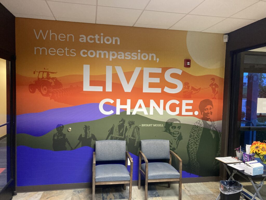
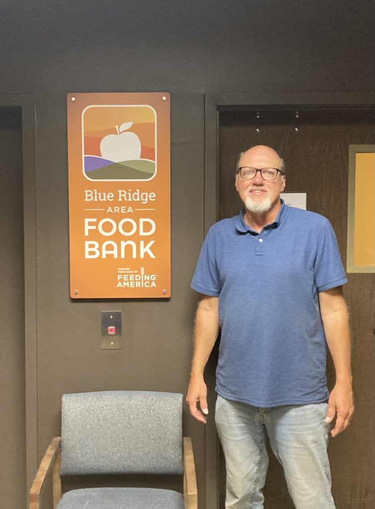
I had worked with the Blue Ridge Area Food Bank on many signage projects in the past, but nothing was quite as ambitious as this one! I was installing some door name signs at the Food Bank’s Charlottesville, Virginia branch and just happened to meet Les Sinclair, their communications manager. Les was looking for a firm capable of designing signage and graphics to help brand their headquarters building in Verona, Virginia. It just so happened that my point of contact with Eastern Mennonite, Brand Manager Jon Styer, had recently set up his own private consulting business, At Ease Design and Consulting, so I referred Les to call Jon. A few months later I received a call from Jon saying that he was selected for the project and that he wanted to use me as the sign manufacturer/installer! It was planned out as a two-phase job: The first phase included entry and lobby signage, volunteer directions, and large interior warehouse wall graphics; the second phase included several large exterior warehouse wall signs.
BIG MEETING PLANNED
The Food Bank Network had a big meeting planned in Verona where all four branches of the organization would converge on September 20th. It would be a morale-building meeting and they really wanted us to have the new branding completed by the meeting date if possible. Also because of the heavy foot traffic during normal work hours, the Food Bank requested that we work in the evenings. This arrangement was great since I had many other projects going on that I could tend to during the day.
EXPECTED GLITCHES OVERCOME
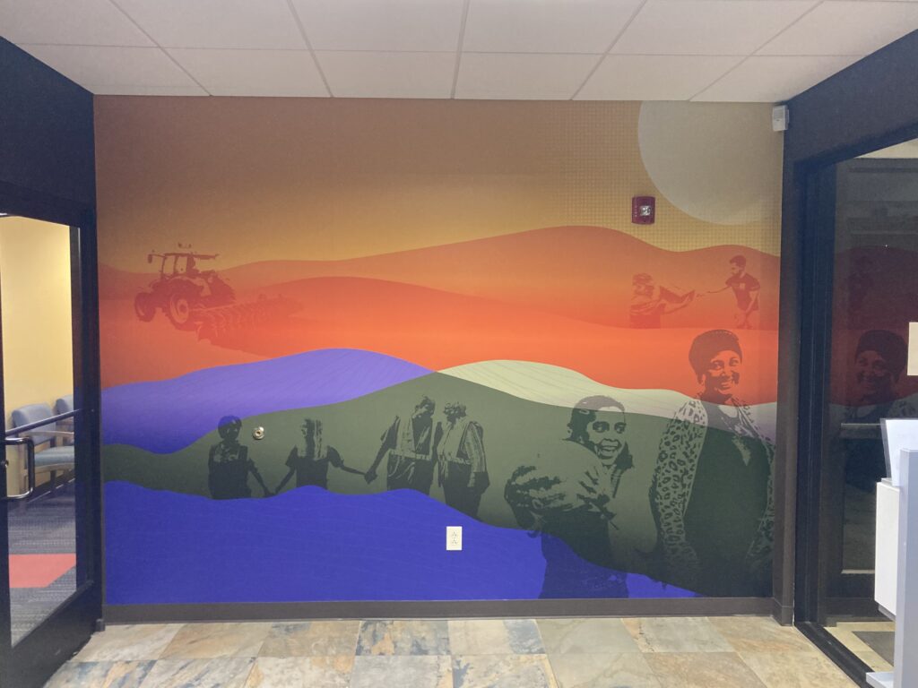
Once the order was officially placed for the first part of Phase 1, I worked with Jon and my digital print supplier to make all the 3M prints required for the job. I was able to cut all the cut vinyl letters on my plotter at the shop. The wall graphics were unique in that the main mural backgrounds were laminated with a satin overlay while the lettering had a gloss finish. Printing the background and lettering separately made it easier to line up things in the field. Jon inspected all the prints prior to installation and we found a few items that needed reprinting. Sometimes the art from the design software we use isn’t read exactly the same by the printer’s rip software making things come out a little differently than expected. Changing the file type corrected the issues we had on a few prints.
A WELCOMING MESSAGE
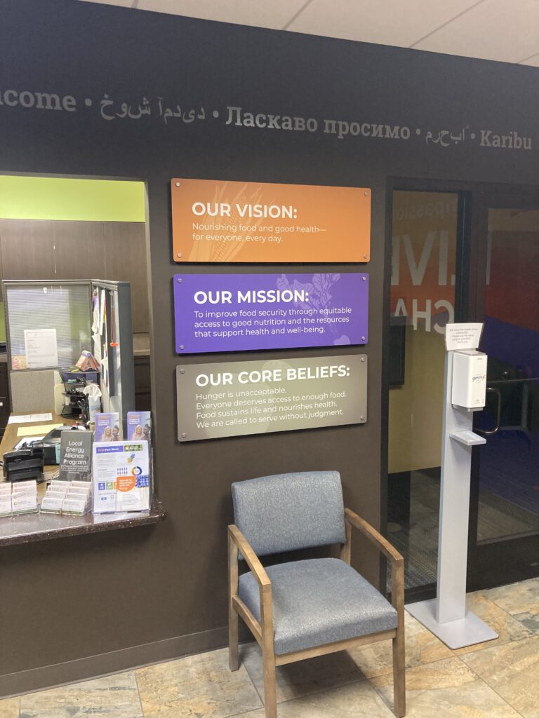
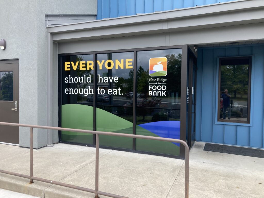
The project included a welcome wall that had “Welcome” written across the main wall in various languages. Over by the elevator, we installed a logo panel and we hung three stacked wall panels to the right of the receptionist area. At the main entrance we spanned three storefront glass windows with an important message, “Everyone Should Have Enough to Eat”. The graphics on the top were made from 3M Controltac vinyl material and the bottom “mountain” portion was made from perforated vinyl so people could see out from the inside of the lobby area.
All in all it was a neat project, but only the first part of a large undertaking. So stay tuned for more pictures as things are completed.
Mark Hackley owns Augusta Sign Company, Staunton, VA. 540-943-9818
